Understanding your dashboard
Your site’s dashboard is where you spend most of your time. This page walks through every card, chart, and panel, top to bottom.
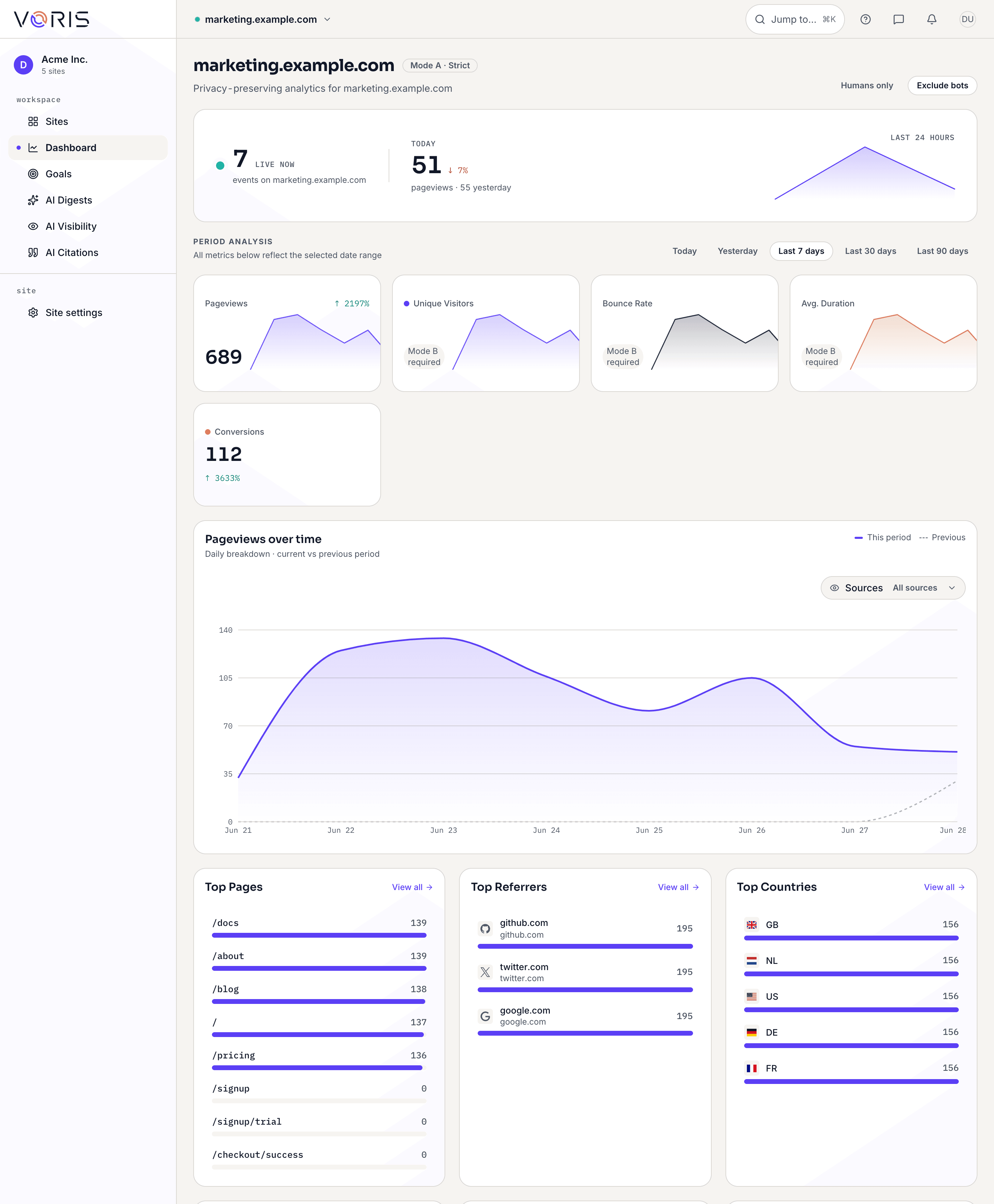 Dashboard overview
The period selector
At the top of the dashboard is a period selector. It controls the time range for everything on the page.
Your choices are:
- Today — events from the start of today (in your timezone).
- Yesterday — the full previous day.
- Last 7 days — the default view when you open the dashboard.
- Last 30 days — month-at-a-glance.
- Last 90 days — the wider trend.
- Custom range — pick a start and end date.
Changing the period updates every card, chart, and panel on the page.
The live indicator
At the top of the dashboard you will see a small green dot with text like:
12 events in the last 5 minutes
This is the live indicator. It refreshes every 30 seconds on its own. If you are on a Mode A site, it counts events (page views plus Core Web Vitals reports if enabled). On a Mode B site it counts visitors instead.
No dot or a count of zero? No problem — it just means no events have arrived in the last five minutes. Try visiting your site in another tab to see the number tick up.
Big-number cards
Across the top of the dashboard you will see four big-number cards. Each reflects the currently selected time period.
Pageviews
The total number of page views in the selected period. Every time a visitor loads a page on your site, it counts as one pageview.
Unique Pages
How many distinct URLs on your site were viewed. If a hundred people all loaded your homepage and nothing else, this would be 1. If they spread across your homepage, pricing page, and blog, it would be 3.
Top Country
The country that generated the most pageviews in the selected period. Country is derived from the visitor’s IP address during ingestion and the IP is discarded immediately after — we do not store it.
Bounce Rate
In Mode A, this card shows Available in Mode B+. That is because bounce rate needs a way to tell whether a visitor looked at one page or several, which requires sessions. Sessions are part of Mode B. This is normal and expected for Mode A sites.
The pageviews chart
Below the big-number cards is a chart of pageviews over time.
- For Today and Yesterday, points are hourly — 24 points total.
- For Last 7 days, Last 30 days, and Custom range, points are daily.
Hover over the chart to see exact counts for each point. Spikes and dips usually reflect campaigns, publishes, or outages — trust the shape, not the exact pixel-level detail.
Breakdown panels
Underneath the chart are several breakdown panels. Each shows a ranked list for the current period.
Top Pages
Which URLs on your site got the most views. Useful for: spotting what content resonates, finding surprisingly popular pages, confirming which landing page your campaign is driving traffic to.
Top Referrers
Where your visitors came from. Sites that linked to you, search engines, social platforms. A visitor with no referrer (for example, someone who typed your URL directly or clicked a link in an app) is counted as Direct. To see which of these sources actually convert, pick a goal on the full Sources report — see Conversions by source.
Top Countries
Where your visitors are physically located, rolled up to country level. Useful for: confirming which markets you are reaching, spotting unexpected traffic from a country you do not serve.
Top Devices
Split between desktop, mobile, and tablet. Useful for: deciding whether your mobile experience needs more love.
Top Browsers
Chrome, Safari, Firefox, Edge, and whatever else visitors are using. Useful for: deciding whether to test in a particular browser.
Top OS
Windows, macOS, iOS, Android, etc. Useful for: confirming your platform mix.
Top UTM Sources
If you tag your outbound campaign links with a ?utm_source=... parameter, this panel shows you the top values. Useful for: measuring how each campaign performs. If you are not familiar with UTM tags, the short version is: add ?utm_source=newsletter to a link you share in your email, and visits from that link will group under newsletter here.
Top Entry Pages (Mode B+ only)
Shows the first page a visitor landed on before clicking around. In Mode A, this panel is locked and labelled Available in Mode B+.
Export CSV
Every breakdown panel has an Export CSV button. Click it to download a CSV file of the current panel’s data, respecting your current period selection. Useful for: pasting into a spreadsheet, sharing with someone without an account, feeding numbers into another tool.
Core Web Vitals panel
If you have turned on Core Web Vitals collection in site settings, you will see a panel called Core Web Vitals with five metrics: LCP, INP, CLS, TTFB, and FCP. Each is colour-coded green, yellow, or red based on Google’s thresholds.
If CWV is off, the panel shows:
No CWV data yet — enable in site settings
Turning it on is a toggle — see Site settings or the dedicated Core Web Vitals page for details.
Goals panel
Near the bottom of the dashboard you will see a Goals panel with a Coming in a future update message. Goal tracking is not yet available. When it ships, you will be able to define things like “form submissions” or “signups” and see conversion counts alongside your other metrics.
Empty state
If you just installed the script tag and no data has arrived yet, the dashboard shows:
No data yet — install the script tag to start collecting analytics data.
If you have installed the script but still see this, go to Troubleshooting.
Related
- Privacy modes explained — why some panels say “Available in Mode B+”.
- Core Web Vitals — what the CWV metrics mean.
- Sharing dashboards publicly — send a read-only version to a client.
- Regions and cities — drill from a country into its regions and cities (rolling out).
- The Campaigns report — break traffic down by every part of a UTM tag (rolling out).
- Filtering your reports — stack filters to focus every panel on one slice (rolling out).